[THESIS] User Flow

I haven't written in a while, not because I've been maxxing and relaxxing, but because ​I've been in my head, trying to make a million tiny/huge decisions about how my app will function, and then what it will look like, and then how it will function, etc. This seems to be a characteristic of UX design, and it made me absolutely hate the process until I was able to collaborate with others, which then made it super fun and seem like something I'd like to do professionally.
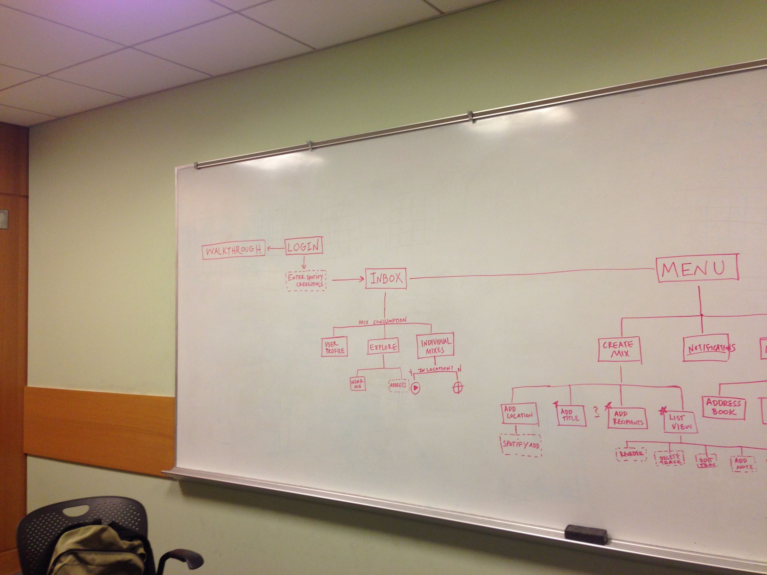
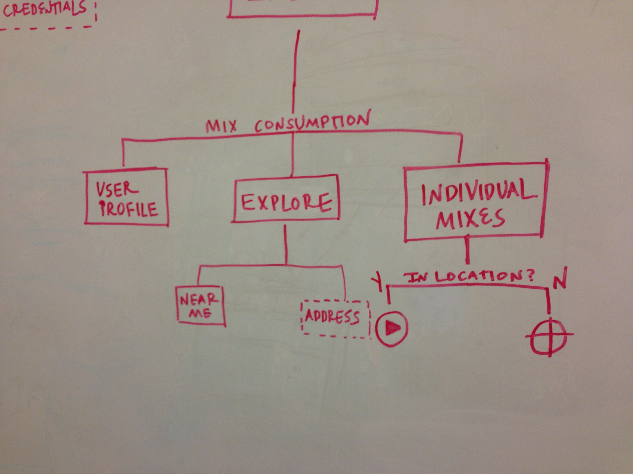
After some quality time with theSarah Hallacher and Trent Rohner, I finally have a User Flow that makes sense to me both visually and executionally. Dashed outlines mean User Input, solid outlines mean Functions, and solid blue boxes mean Pages.

Dig.it_UserFlow_V2-01.jpg

Visual Diary: Final Project Proposal

For our final project, I was a bit torn with feeling like I needed to do something in the P-comp vein. But, quite honestly, I just haven't been able to come up with any solid ideas that involve my building something electronic. ​

That said, I have really enjoyed the Digital Footprint portion of our class, and have become quite fascinated particularly with the images that mark our digital experience.​

Last week, I worked on the beginnings of a picture book that abstractly visualized gchats between two people. I was very set on seeing this idea through to print, and then found the data that Google has saved for my own image searches.... from 2008. ​

This has me kind of torn... working on a project that's about two people communicating with one another, taken to abstraction through an almost crowd-sourced curation, and then presented as a story, OR presenting a digital footprint as a diary, with image searches marking specific days and conjuring memories of searches.​

I plan to either decide later tonight, or have the class' feedback help me out tomorrow.​

Digital Footprint: Generated Screen Savers and G-Chat Picture Books

This week, I had fun tracking a ton of activity from my input to my computer... key strokes, mouse clicks, application usage, etc. However, I didn't feel that there was enough data to make anything terribly interesting, so I chose to run the Most Interesting Words of the Month program on my entire Google Chat history with another person.

Screen Shot 2013-02-27 at 10.34.11 AM.png

I thought this was fascinating from Google's perspective, especially. Though I can recall specific conversations from some of the words, to a third party, especially a machine, what does this look like?

I thought an appropriate visual translation would stick with the idea that we were using a Google service to chat... so what does Google Image Search see from these things? Is the abstraction funny? does it still tell a story? I batch-downloaded 30 images for each of the words in the first column, as a test to see if this could make an interesting representation.

Here's what I got from a very very rough layout for the word 'whenever'. Shakira is involved, so it's not a total failure.

ContactSheet-001.jpg

As you can imagine, even with a lot of automation, this is a time-consuming process. If I decide to continue, I'd like to experiment with layout and index (how much of the chat do I include? is each page just referenced in the back of the book? Would this make an interesting coffee table book?).

Another visual experiment I did involved taking screen grabs of my desktop every minute for a full day. I'm mainly interested in this as a means of visualizing both productivity, but also to see what sorts of colors we are exposed to throughout the course of the day. Are most of the websites I visit white? What does this look like as an abstracted video? Again, I thought it only made sense to translate this visual tracking to something that would also exist in the same environment. So, I generated an abstract screensaver from my computer's activity from Feb. 21st.

Here is the video: